Typography - Page 3

Learn how to work with fonts, lay out typography, pair different typefaces, and find collections of inspiring fonts to use in your next project.

PowerPoint Templates / 22 Apr 2022

Choosing the Best Font for PowerPoint: 10 Tips & Examples

There’s a fine art to creating a great PowerPont presentation that wows. With so many tricks and features in this little bit of software, it’s more likely to see a bad presentation than a good one (and you don’t want to be that person!)

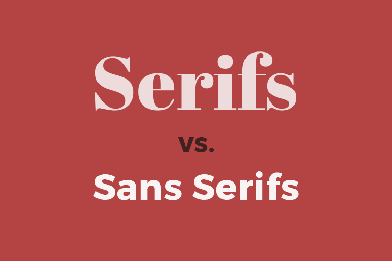
While there are a lot of factors that contribute to the overall design, choosing a suitable font for PowerPoint is near the top of the list. The audience needs to be able to read the words on the screen with ease, to ensure that your presentation is as effective as possible.

So how do you do it? Where do you start when choosing a font for PowerPoint? We have 10 tips for you with a few examples of PowerPoint slides (and templates) that will impress your audience.

Trends / 4 Feb 2021

Design Trend: Text That’s Not Readable

Let’s start with a definition. Readability is a measure of how easy a piece of text is to read. The level of complexity of the text, its familiarity, legibility, and typography all feed into how readable your text is. Readability is a key factor in user experience.

Why would we ever showcase a design trend that features text that’s not readable? Simply, because it is popular. Does it mean that it’s a good idea? It… depends!

You can read on, look at the examples, and decide if it is right for your projects.

Font Collections / 7 Dec 2020

Web Typography Rules: What You Need to Know

90% of all the information on the web is in writing. That means that typography is a skill that dictates that 90%. That’s a staggering figure that highlights just how important typography is.

It’s absolutely everywhere: blog posts, social media, magazines, reports, books, and so much more.

What this means for you as a designer is that text is your primary means of communication. If you haven’t got your typography skills down, then you’re not going to be able to deliver your ideas to your audience.

Luckily for you, we’ve got a list of useful tips and rules that you can follow to avoid that happening. Even if you’re not the best at typography, follow the information that we’ve laid out here, and you’re going to be fine.

Typography / 12 Oct 2020

9 Reasons Why You Should Use Open-Source Fonts

This is a love letter of sorts to an underrated design tool: open source fonts. Open source fonts are licensed in such a way that anyone can use them for any project at no cost.

Many open source fonts come with the standard Open Font License (you can find it here), and it gives you huge flexibility in how you can use them, the types of projects they are suitable for, and how they can be distributed.

There are plenty of reasons to try open source fonts for projects online and in print. And every typeface featured in this post is open source!

Font Collections / 23 Sep 2020

Serif vs. Sans Serif Fonts: Is One Really Better Than the Other?

There is an ongoing debate among designers – both print and digital – about what makes an ideal typeface for a project. The debate almost always breaks down to a single question: serif or sans serif?

Before you answer that question, think about all of the things you know about serif and sans serif typefaces and all the myths associated with them.

Today, we’ll take a look at both categories of type and try to determine if one is really better than the other, and in what circumstance.

Font Collections / 27 Apr 2020

How to Pick a Font (For Any Design): 10 Tips & Principles

Choosing the right font for a new project can be exhilarating. But it can also be a major challenge. Fortunately, there are some timeless rules you can follow when deciding how to pick a font.

Whether you’re going for a super-subtle and simple design, or a bright and bold layout with impact, you’ll always need to consider some similar trade-offs with typography.

How to pick a font is less about specific steps and more about creating the right feel for a design project. Here’s how you do it (with some examples of lovely typography choices).

Font Collections / 18 Nov 2019

What Is an Icon Font? (And How to Use One)

Icon fonts are a popular solution to a common CSS problem; how to incorporate web icons into your website design in an efficient, fast-loading way.

With plenty of services available to make choosing and using an icon font easy, you don’t have to create your own from scratch. Icon fonts are all over the internet.

But what exactly is an icon font? And how do you use them? Here’s a guide to everything you need to know about icon fonts.

Typography / 7 Oct 2019

8 Things to Stop Doing With Typography (Right Now!)

Good typography is an art that shouldn’t be messed with too much. Letterforms flow together to form words and phrases that are readable and have subtle visual meaning.

But if you aren’t careful, it’s easy to ruin typographic beauty in an instant.

If you have slipped into any of these design traps, this is the time to stop doing anything on this list to type and clean up your design pieces. (Your portfolio will thank you.)

CV & Resume Templates / 3 Sep 2019

What’s the Best Font for Your Resume or CV?

It might sound a little silly at first, but the typeface you select for your resume design can speak volumes to potential employers. The font represents your design style and professionalism. It can also impact how the person looking at your resume perceives the information at hand.

The typeface you select makes a first impression with every person you might meet in the interview or hiring process. (They’ll likely see your resume before they ever meet you.) Make sure to set the right tone from the start.

We’re exploring the best free fonts for resumes today. Here are a few top-notch font choices that are resume-ready, and all completely free!

Typography / 3 Sep 2019

What’s the Deal With Em and Rem?

With all the talk about designing for responsive websites, two little words keep cropping up – em and rem. But what are they?

Em and rem, along with pixels, are units and methods to measure and resize type. Em and rem are relative, rather than static, units and are being used more and more for responsive web design schemes. Let’s dive into this concept today and explain things a little more clearly!

Graphics / 29 May 2019

10 Web Design Trends We’re Already Over

Design trends have to be used cautiously. Just as quickly as many trends come into fashion; they can fall out of favor and make a design feel dated.

Don’t ignore them completely — testing out trends can stretch your creative muscles and help you create something you might not have tried otherwise. But do be aware of what’s fresh, what’s timeless, and what’s out of date!

Here are 10 design trends that are over (or should be anyway).

Font Collections / 8 May 2019

6 Tips for Working With Hand-Drawn Fonts

Hand drawn fonts seem to be almost everywhere. But how do you use them in a way that’s different and effective? When it comes to hand-drawn fonts, these tips can help you create something that’s readable and matches the tone of your project.

The hand-drawn font design trend can be somewhat tricky and isn’t necessarily for all projects.

If you do go down this route, make sure you’re approaching it in a way that doesn’t compromise the goals of your design project!